Död & Undergång på Östergötlands Museum! ( death & destruction)

Utställning|2017.06.17 —2017.08.20

Död & undergång

Skisser och original av illustratören och konstnären Mattias Frisk

En utställning med skisser och original framtagna för metalband av illustratören och konstnären Mattias Frisk. Vi får här ta del av processen från idéskiss till färdig bild.

Som illustratör har Mattias Frisk framför allt arbetat med skivomslag och t-shirtmotiv, både till svenska och utländska undergroundartister. Han har även gjort ett flertal illustrationer åt det grammisbelönade rockbandet Ghost.

Mattias Frisk har en masterexamen i Konstnärlig gestaltning och en filosofie magisterexamen i Konstvetenskap och visuell kommunikation. Han är även musiker, i death metal-bandet Vanhelgd, och mannen bakom Mjölby porslinsrävsmuseum.

Kontakt: Thomas Clifford
Kostnad: Ordinarie entréavgift
Plats/lokal: Östergötlands museum, Sal D, Lilla galleriet


http://ostergotlandsmuseum.se/posts/1932

Stitching things up

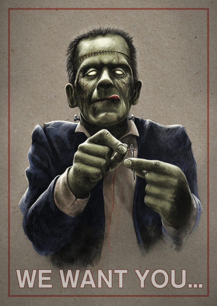
This is an illustration I made for ARTEX a couple of months ago. One of the CEOs got the idea to do something “darker” when visiting my studio so I came up with this Uncle Sam/Frankensteins monster stitching himself up mash-up (drawing on paper and digital coloring). ARTEX is the largest business enterprise in Sweden in industrial sewing and uppholstering so I guess that fits them well 🙂 . The company was founded in Mjölby in 1928 and today we have four production units in Sweden and in Latvia.

A5_Horizontal

Clandestine

November 12 means the 25 year anniversary of the fantastic album ”Clandestine” by Entombed. I got the opportunity to see a killer set at “Close-up båten” by the way! This album meant so much to me in shaping me both musically and artistically when I first heard it in 1992 and I still consider it the ultimate death metal album. Back in 2015 I did this piece when reflecting on influences and subculture and the tension in between growing up and being a child. ( still got a few prints of it in my shop, art-prints section, use the code “clandestine” for 25 % off)

midningt-fishing


Ghost backdrop 2015

ghost_backdrop_done


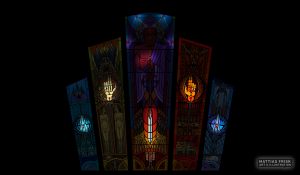
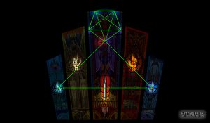
A lot of people have been asking me about the symbols in the backdrop design I made for the Swedish band Ghost so here is a small guide to the images in it and how it was made.

From my meeting with the clergy concerning this job I got quit few guidelines about the content but regarding the overall design there were some demands that I had to work from:

  1. It should be based on an art deco window design with five windows.
  2. The windows should be framed by marble
  3. Satan should be in the middle.
  4. There should bee a reference to the five wounds of Christ and to Adam and Eve as well if possible.


 Process 

The clergy explained to me that I should think of the design as if being in a fancy office with these churchlike stained glass windows, so I decided to keep the design very modernistic and rely a lot on distinct form instead of making a romantic interpretation of the baroque, renaissance or medieval visual rhetoric’s. The silhouette of the windows made it quite tricky to keep a balance as a whole and even more inside each window. The shape of the windows were designed in CorelDraw ( I used to work a sign maker, we used CorelDraw for everything and I still think it’s so much faster than Illustrator). After printing the shape I started to work with pencils. When I was done I took a photo of the design and cleaned it up a bit in Photoshop and then colored the whole piece digitally.

ghost_backdrop_bW


I then experimented a bit trying to remember how we marbleized papers back in elementary school and got some decent looking results. I scanned them and adjusted the colors and built the wall in Photoshop.

ghost_backdrop_color ghost_backdrop_done ghost_backdrop_wounds ghost_backdrop_wounds_line_penta

 Imagery 


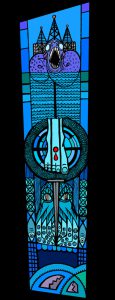
The overall design is based upon the five wounds of Christ accompanied by nails, and for the middle panels the lance of Longinus in the hands of our mighty lord Satan, bringer of light and destroyer of worlds. I decided to go with the five elements as an overall theme for the window, one element represented in each window, from left to right, water, earth, aether, fire and air (each nameless ghoul has been given an element so I thought that it was a good idea).
panel-1-water panel-2-earth panel-3-aether panel-4-fire  panel-5-air

Panel 1 – Water
Leviathan with an oil rig on his back that drills for oil at the bottom of the panel. In the middle of the panel there is a foot with a wound and below it a nail. Kraken and some (dead Jesus) fish.

Panel 2 – Earth
Sunset over the mountains and an entrance of a mine. The shapes also echoes skyscrapers and represent the dusk of civilization. Below is the sign of the Grucifix surrounded by a worm and a skeleton hand with a wound. A sprout and a fresh and a dead leaf represent the path towards death. To the left an hourglass with all sands at the bottom and to the right a rat and underneath Adam and Eve resting in their casket, divided by a nail. At the unlucky couples feet there is a skull an apple, a spider a rat and a snake.

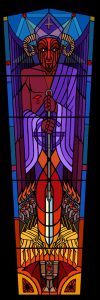
Panel 3 – Aether
Satan in a purple robe, the color of emperors and kings. Each point of the pentagram halo has a sign that represent one of the elements. In His hands he holds the lance of Longinus that made the lethal wound in the side of Christ. The lance is surrounded by a shape that both echoes a flame and a drop of blood, to the left and the right the armies of Pandæmonium and beneath them a Chalice.

Panel 4 – Fire
A dragon above an infernal mandorla that surrounds the left hand of a demon. Beneath the mandorla there is a nail and from the bottom of the panel to the top the nine circles of hell are represented.

Panel 5 – Air
Smoke above chimneys and a skyscraper above the clouds. A foot with a wound and a nail under it and a bat above a sacrificial lamb upon a pyre flanked by two empty bird cages.

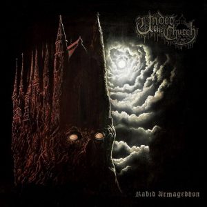
Under the Church – Rabid Armageddon

11880508_10153028792896078_502531421049783422_n

Some time ago I was asked to make a shirt design for Under the Church and I guess they liked it since they asked me to do the cover art for their first full length album Rabid Armageddon. Initially the process was quite slow, the band had an idea that I did some sketches on. While trying out the bands idea I found an old sketch that I played around with a bit and sent them. Actually I think I made it while trying out brushes in Photoshop, a Friday afternoon doodle. Both Pulverised Records and Under the Church liked it and we decided to choose that path instead. I think it was more in line with the music and it’s quite a simple design which often is good for making the album art easy to recall and remember. I think it looks like a cover for an eighties horror book or something.

The recording is grim and dirty plain old school death metal so my goal was to create something expressive and threatening rather than a nicely drawn illustration. Since I wanted it to be ruff and dirty I decided to paint it by hand in oil on panel. I experimented a lot with the underpainting using a black base and withe pens, acrylics and even some air-brush that I actually have no idea at all how to use but it worked well when shading the clouds. The oil painting was more like tinting the underpainting. I used a lot of medium to make the paint transparent and did a couple of layers. Finally I did some digital highlights and adjustments before putting the whole layout together.

The Great Discord

Finally I am able to reveal the artwork for the Great Discord!
The process started about 1,5 year ago and have been slow but very interesting and a bit different from what I usually do when it comes to album covers (NO SKULLS!!! Fia told me on our first meeting). The band had a clear vison on what they were looking for but at the same time leaving me free to do the best with their concept. What makes this a bit special for me is that I got quite a lot of room for experimentation; I used Photography, cut and paste, prints, painting and digital painting to create the artwork. Martin Frid and Jenny Brännare helped me out in a lot of different ways, cutting out trees from paper, being models and giving me a lot of feedback!

Cover-v2flat
Cover art

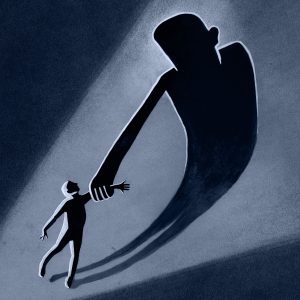
The cover art was created with gouache on paper, pen on paper and some (a lot) of digital painting and editing. The band wanted a small figure whose shadow was towering above him in a threatening way and painted in a way that reminded of art deco.

Cover-arm_flat
Album image

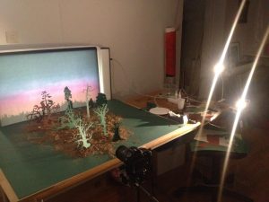
The inside of the gatefold vinyl version displays a forest with a number of figures that connects to the songs on the album. We were talking about the forest theme on an early stage and we spoke of my painting “Waiting for the dawn” as some kind of reference. I recall that we were looking for a surreal fairytale that should both be enigmatic and frightening but not really “standard”. Making this image was both interesting and time consuming. I made some really fast test images on an early stage before I presented my ideas about the forest for Aksel and Fia. With the help from Martin and Jenny I build a miniature landscape in the studio. We took some photos based on the bands ideas: a man dragging a corpse, someone mourning a dead person, an old man and so on. Then we printed them and placed them in a forest of paper trees and real branches. I used a print on a forest taped to a light box for background. When I found a shot the worked I printed it on aquarelle paper and painted on the figures and some trees, then I took a photo of the print and worked with it digitally, adding some trees, moving one figure and colored it in the same blue tone as the cover image.

10846765_10152655332669232_828529366_n
Progress shot

10450326_10152805549069232_1994559594652307770_o
Album image

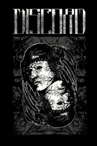
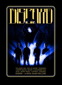
I also made four t-shirt designs, two based on the artwork and two original.
logotröja

fiav3

demons2

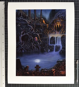
Midnight fishing by the clandestine spring

“Midnight fishing by the clandestine spring” by Mattias Frisk  is a signed, limited edition, fine art digital print with an edition of 10 40x50cm and 10 50x70cm. It will be available on Friday the 27th of February. http://mattiasfrisk.bigcartel.com/

It´s obviously an homage to one of the most important artist in the extreme metal scene: Dan Seagrave.
Seagraves paintings had a huge impact on me when I was young and inspired me to draw and paint. Sometimes I bought records just becouse he made the cover – with a great cover it cant be bad music… right…

Midnight fishing by the clandestine spring


A new hope

painting

Today I started to paint. Not on commission, not an illustration.

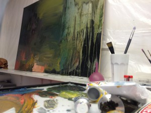
I have not painted for at least half a year and have no hope that it will work out fine on the first try, if I continue this task on regular basis I might have got back into the understanding of the process by the summer. Painting is getting harder for every year that passes, for every image I see. When thinking about it now it seems logic that my approach to painting is similar to what I used to do 15 years ago, just drowning everything in dissolved oil colors, killing every hue, now I have to wait for a week or so until I can start again. It’s a total mess. The notion of the “temple” kept coming to me while working. Maybe that will be the gateway.